In 2017 I was invited by Under Armour to submit a design "test" as part of an interview process for a potential spot on their design team. Given only the broad guidelines of designing at least three pieces of apparel for men, women, and children, in two different colorways (one for the Orioles and another for a team of my choosing) -- I submitted the following:
Men’s Clothing
A simple, minimalistic Division Champs shirt without all the usual fanfare, relying instead on a simple phrase, team logo, and year to communicate the message. The varsity block lettering is timeless -- it was chosen for its flexibility to feel both modern and vintage.


For most fans, whether it’s on TV or fantasy box scores, the version of their favorite team's name they most often see is the scoreboard abbreviation, which is the inspiration here.


Every broadcaster has a signature phrase, and Gary Thorne of the Orioles and Drew Goodman of the Rockies are no exception. The upward slanting text is meant to evoke the excitement and enthusiasm with which the phrase is shouted.


And every team has their own signature playing field dimensions, which the team logo and UA logo are locked up tightly inside of.


I wanted to take the trendy tone-on-tone look to a different level by letting the logo stand out just a little bit more with a glossy, almost reflective graphic on top of performance material.


Women’s Clothing
A strong, sturdy typeface with a hint of fun spells out a simple form of encouragement that we've all quietly repeated under our breath in tenser on-field moments, or yelled out loud while jumping up and down -- it's a universal baseball phrase.


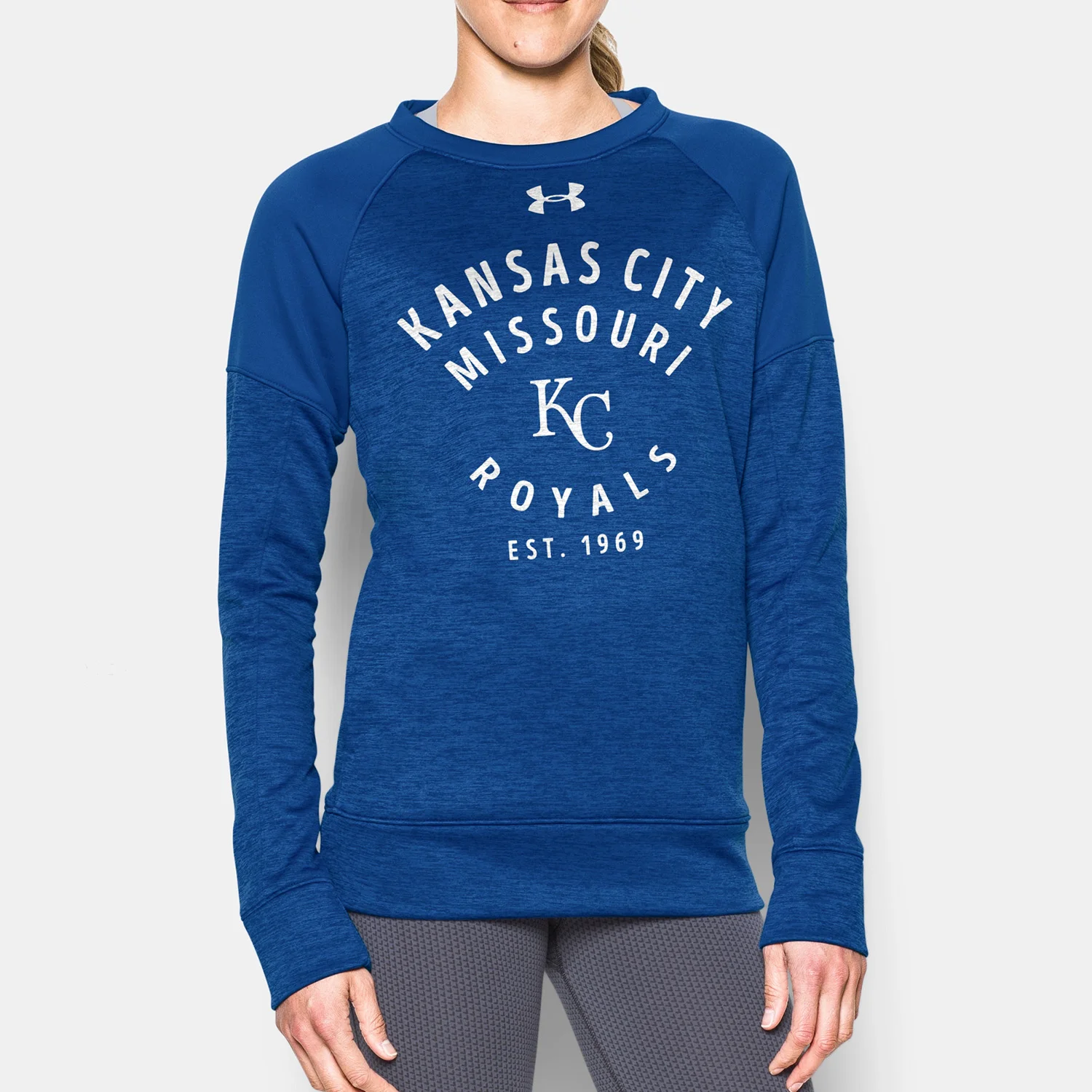
A vintage look that would incorporate the team's home state, original logo, and date of founding. The retro look is capped off with a rounded, imperfect type.

Again took the trendy tone-on-tone look to a different level by letting the logo stand out just a little bit more with a glossy, almost reflective graphic on top of a light, heathered material.


To celebrate the All Star Game in Miami this year, these shirts feature team logos rendered as neon lights, reminiscent of all the neon signs throughout South Beach.


Kid’s Clothing
The modern block lettering of "Rivalry 0117" and an enlarged UA logo help to create a tough look, while the MLB logo makes it feel like a standard issue team shirt.


A "team cheer" girls tank, with the logo locked up inside the O to read "Go [team]". The type was meant to balance the line between sporty and feminine.


Another instance of my new favorite sports typeface "Rivalry 0117" (used here in a different form), to help create a strong and simple athletic team-issue shirt.


I like the typeface used here ("Homestead") because its textured, cross-stitched look feels warm like a quilt (perfect for a winter fleece) and also childlike when used with pops of color.


This final look was inspired by the current trend of players wearing contrasting color compression sleeves on one arm.

