the design process
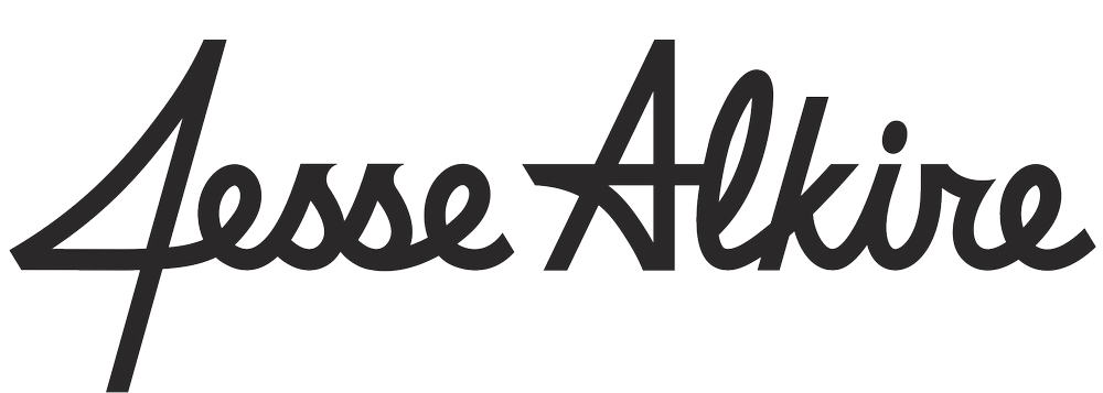
The old marks, understandably, had some small imperfections that were cleaned up to create a more consistent look across all brand elements.
new script
old script
The A’s actually utilize three slightly different iterations of their primary capital A logo – one in their primary roundel logo, one on their hats, and one on their jerseys. So to streamline the brand, I designed a single capital A that matches the script A to use across all apparel items.
Each logo has two versions – a flat option for hats and licensed apparel, plus an elevated version for jerseys-only that mimics the upward motion of the home and away scripts. This way every uniform has a consistent feel no matter the hat/jersey combo.
